Because a picture is worth a thousand words
Even the most astonishing data can disguise insights and appear ordinary if not presented adequately, and the best data visualizations balance information and design.
As maps are becoming more interactive and visually appealing, spatial data visualization is stepping up its game. We present inspiring suggestions on how to add value to your visualizations on maps.
Map visualizations below are built using the Mireo Comapct Maps Map API platform and the open-source Mapbox GL JS SDK.
Cable, the British company specializing in transparent broadband deals comparison, released its 2021 Worldwide mobile data pricing report based on over 6,000 collected mobile data plans. The summarized results showcase the average cost of 1 gigabyte.
Countries on the interactive map are color-coded by the average price of 1 GB of mobile data. To take into account the economic strength and living standards, switch the view to examine the prices scaled with the country's' GDP per capita.
Data source: cable.co.uk, imf.org
map layers interactive controls
Add polygons to a map using a GeoJSON source and style polygons using the fill-color
paint property.
Use IControl
interface for interactive controls on the map.
Names are a look at cultural trends, commonalities, and differences around the world.
Every country has a set of extremely common, borderline overused first names. It's either James or Mary in the USA, Oliver or Olivia in the UK, Marija or Ivan in Croatia.
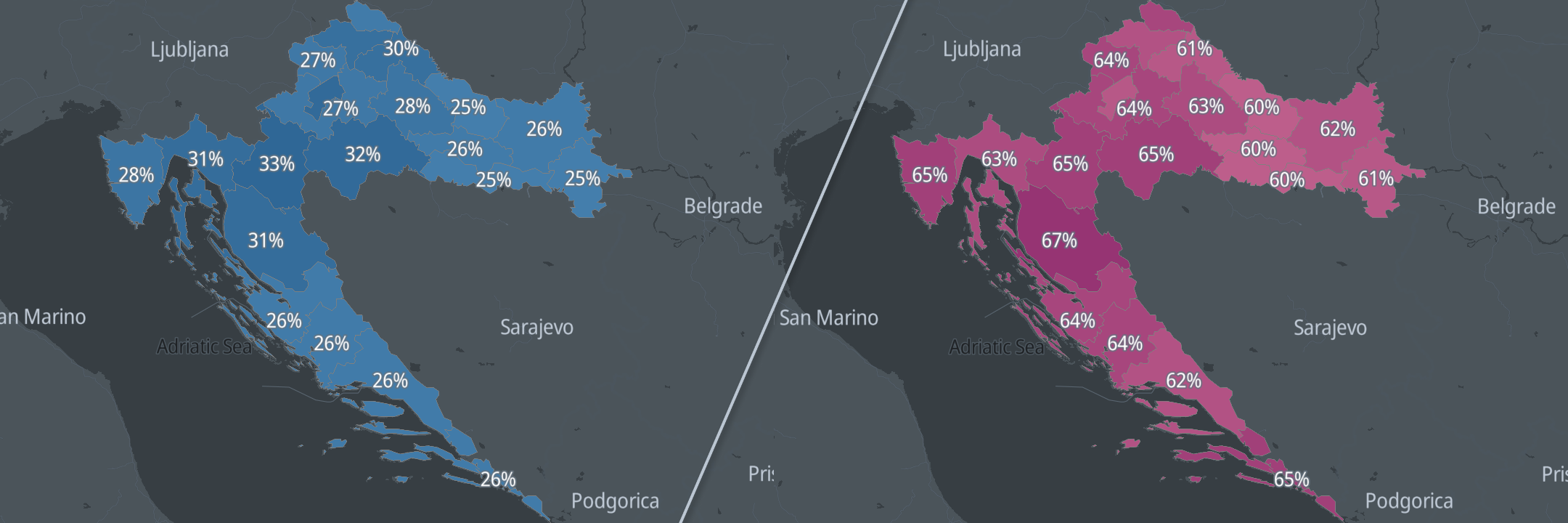
Based on 2011 Croatian census data, we've designed an interactive map with the most common first names in Croatian counties. The data is grouped by age and gender.
Data source: The Croatian Bureau of Statistics, Census 2011
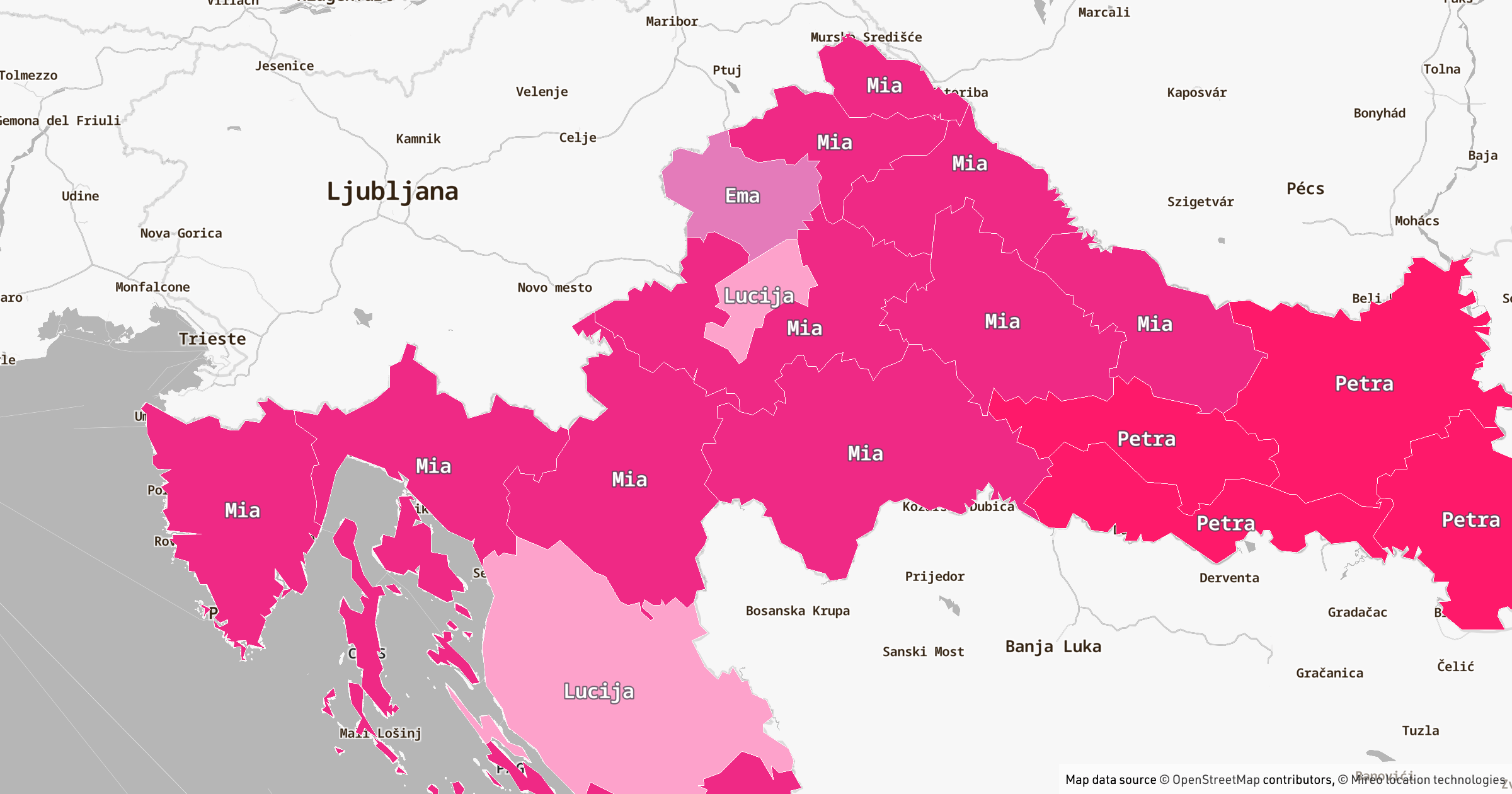
The most common names in Croatian counties
map layers interactive controls
Add polygons to a map using a GeoJSON source and style polygons using the fill-color
paint property.
Use IControl
interface for interactive controls on the map.
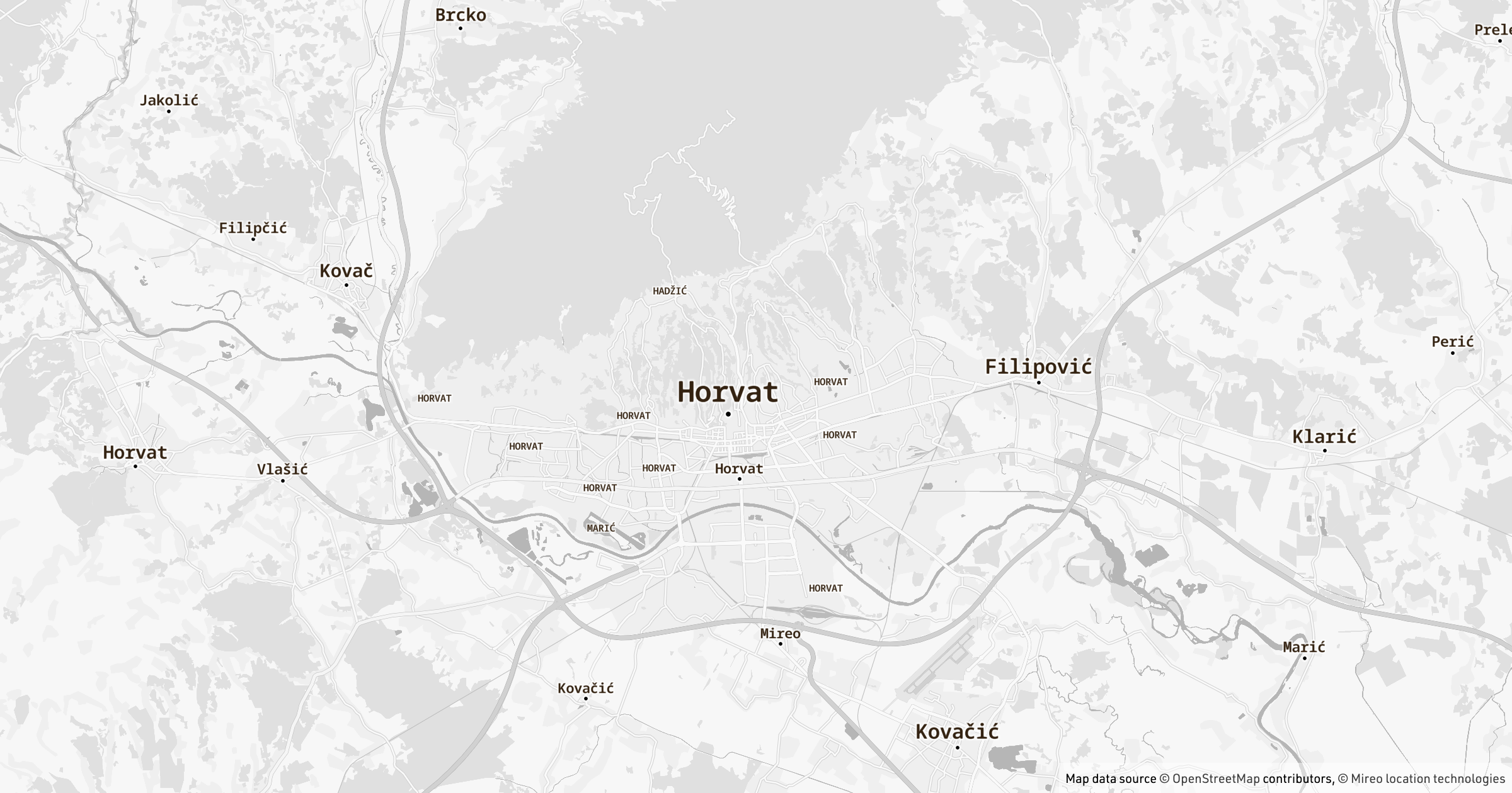
Everyone certainly has an idea about the common surnames in their country or city.
Based on 2011 Croatian census data, we've designed an interactive map with approximately 500 cities and settlements replaced with their top 3 most common surnames.
Croatians out there, make sure to check your familiarity with the topic! To make things easier, the map on the left is a standard map of Croatia, and the right one is the map of surnames. Zoom in, explore, and enjoy your quest!
Data source: The Croatian Bureau of Statistics, Census 2011
The most common surnames by settlements
data sources interactive controls
Manipulate the data source and change the map appearance.
International Women's Day is the time to reflect on progress made in gender equality, among many aspects.
To promote the awareness of the equal distribution of women in men in Croatian society, specifically the equality in leadership roles, we've gathered an insightful visualization of women in the labor market. Although women excel in education, this success doesn't translate into the higher numbers of women in leadership positions.
Data source: The Croatian Bureau of Statistics, Census 2011
The distribution of female workers by occupation
map layers
Filter objects on the map, add polygons to a map using a GeoJSON source and style polygons using the fill-color
paint property.
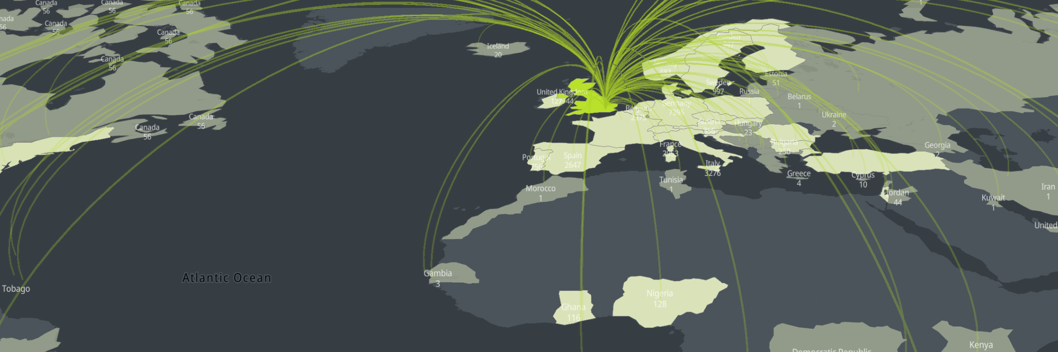
New SARS-CoV-2 variants are spreading around the world. Here's an overview how UK (B.1.1.7), South African (B.1.351), and Brazilian (P.1) variants spread around the globe.
Hold the right mouse button and move the mouse to tilt and rotate the map for a better view. Zoom in to display the reported number of cases per country.
Data source: Pango Lineages, CDC (2021-03-18)
Tracking SARS-CoV-2 variants
map layers deck.gl arc layers
Using deck.gl library render WebGL-based raised arcs on the map. The arcs are joining pairs of source and target points.
Swedish have the concept of Fika, Danish have Hygge, Italians have Dolce far niente and Croatians have the Coffee sipping culture.
When it comes to coffee, we Croatians don't take it for granted - we genuinely appreciate coffee, and we don't take coffee to go. Instead, it's all about socialization and relaxing. Coffee break is that very special time to get a break throughout the day, to enjoy free time chatting with friends. We love to drink leisurely espressos for hours and sincerely enjoy sipping this dark liquid in our favorite coffee shops.
Three months after the second lockdown in Croatia, coffee shops with outdoor spaces are finally allowed to reopen.
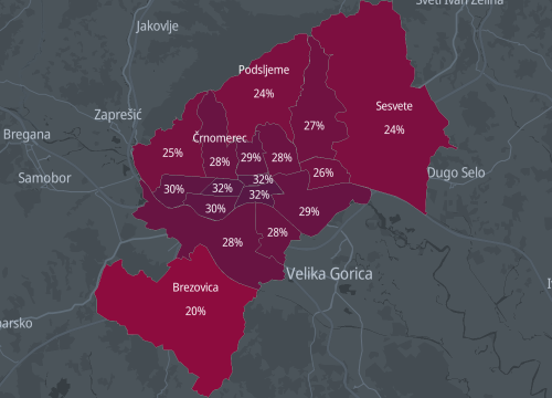
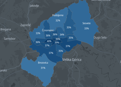
Therefore, just for fun, we've decided to help our fellow Croatians in Zagreb deciding which coffee place to choose for their next break. Namely, coffee is also a very important aspect of dating, and it's not uncommon to have a casual look-see at the beautiful boys and girls sitting around your coffee place. So, we peeked into the 2011 Croatian census data to determine the city parts with the biggest percentage of single men and women, hoping it might facilitate this profound coffee shop selection task.
Data source: The Croatian Bureau of Statistics, Census 2011
Single women in Zagreb county suburbs
map layers
Add polygons to a map using a GeoJSON source and style polygons using the fill-color
paint property.
Single men in Zagreb county suburbs
map layers
Add polygons to a map using a GeoJSON source and style polygons using the fill-color
paint property.